Navigation (Custom Pages)

In this section, you can add pages that appear on the left navigation bar. You specify a navigation icon and a unique URL for the widget to appear on the navigation bar. We recommend using a specific prefix for the URL to avoid conflicts. For more details, see the nav property section.

You can also have a collection of widgets that can display on this page. The page can have a single widget that appears on the screen or a collection of widgets in a grid. For more details on grid arrangement, see the layout property section.

Note

You do not need to add a dynamic-area wrapper to the widget tree. This means that you can drag and drop and resize widgets on custom pages when you enable this option.

Example:

{
    "nav": {
        "label": “Custom Page”,
        "icon": "stored-info",
        "iconType": "momentum",
        "navigateTo": "dynamic-tabs",
        "align": "top",
        "isDefaultLandingPage": true
             },    
    "page": {
        "id": “my - custom - page“,
        "widgets": {
            “
            comp1”: {
                "comp": "md-tabs",
                "children": [{
                        "comp": "md-tab",
                        "textContent": "Shift Timer",
                        "attributes": {
                            "slot": "tab"
                        }
                    },
                    {
                        "comp": "md-tab-panel",
                        "attributes": {
                            "slot": "panel"
                        },
                        "children": [{
                            "comp": “my - custom - timer”,
                            “source”: http: //my-cdn.com/my-custom-timer.js
                                "wrapper": {
                                    "title": "Shift Timer",
                                    "maximizeAreaName": "app-maximize-area"
                                }
                        }]
                    },
                    {
                        "comp": "md-tab",
                        "textContent": "Stock Market",
                        "responsive": "false"
                        "attributes": {
                            "slot": "tab"
                        },
                    },
                    {
                        "comp": "md-tab-panel",
                        "attributes": {
                            "slot": "panel"
                        },
                        "children": [{
                            "comp": "agentx-wc-iframe",
                            "responsive": "false"
                            "attributes": {
                                "src": "https://widget-kad.s3.amazonaws.com/Trading.htm"
                            },
                            "wrapper": {
                                "title": "Stock Market",
                                "maximizeAreaName": "app-maximize-area"
                            }
                        }],
                    },
                    {
                        "comp": "md-tab",
                        "textContent": "Widget3",
                        "attributes": {
                            "slot": "tab"
                        }
                    },
                    {
                        "comp": "md-tab-panel",
                        "textContent": "Three Content",
                        "attributes": {
                            "slot": "panel"
                        }
                    }
                ]
            },
            “comp2”: {
                "comp": “my - google - maps - component“,
                “source”: "https://my-cdn.com/my-google.maps.js
                "wrapper": {
                    "title": "Google Map",
                    "maximizeAreaName": "app-maximize-area"
                }
            }
        },
        "layout": {
            "areas": [
                ["left", "right"]
            ],
            "size": {
                "cols": [1, 1],
                "rows": [1]
            }
        }
    }
},

The following table describes nav and page properties along with their child properties:

nav Property Details

Property

Description and Code

nav > label

This property indicates the page navigation identifier. The screen reader reads this property and it appears in the tooltip.

These parameters are necessary to display your custom page on the navigation bar.

type Navigation.Item = {
    label: string;
    iconType: "momentum" | "other";
    icon: string;
    align: "top" | "bottom";
    navigateTo: string;
    iconSize ? : number;
    iconActive ? : string;
    isResponsive ? : boolean;
};

The label property is the title of the custom page.

nav > iconType

This property represents the type of icon that displays in the navigation bar for the custom page.

The following types of icons are available:

  • Momentum: You can choose any available icons in the collection: https://momentum.design/icons. The advantage of using Momentum is that it provides a few icons with an “active” version.

    Use case of an active version:

    For example, if you choose a Momentum icon type "announcement", you can see the default icon on the navigation bar. When you navigate to the custom page (linked to the icon), the icon changes to the "announcement-active" version automatically. Ensure that you verify whether it has an "active" version of this same icon in the icon library.

  • Other: You can provide a custom image URL (hosted on a CDN) that appears on the navigation bar. If you use a black or white custom icon, the icon isn't visible when you switch between light and dark modes.

nav > icon

This property represents the name of the icon in the Momentum library or the CDN URL.

type Navigation.Item ={
   icon:“announcement”;
}; 
// OR //
type Navigation.Item ={
   icon:“https://my-cdn.com
   /my-navigation-icon.png”;
};

nav > align

This property helps you align the icon to the top or bottom of the navigation bar.

Note

Currently, the property allows top alignment only.

nav > isDefaultLandingPage

This property specifies the default landing page for the agents in Agent Desktop. Set this property to true to make the navigation bar page the default Landing page that appears for the agents after signing in to the Agent Desktop. If more than one navigation bar page has this property set to true, the system considers the first navigation bar page to become the default Landing page.

If no navigation bar page has this property set to true, the Home page acts as the default Landing page.

nav > navigateTo

This property specifies the name of the custom page. This name appears in the address bar when the agent navigates.

Note

The navigateTo must not include the following values: images, fonts, css, build_info, help, app, i18n, icons, images-mfe-wc, and sounds.

type Navigation.Item = {
    navigateTo: “my - custom - page”;
};
page Property Details

Property

Description and Code

page > id

In "page" property, you specify the custom page (dynamic widget) object.

The "id" property represents a unique page identifier. For example, my-custom-page-1. Agent can’t see this identifier on the Desktop.

type DynamicWidgets.Page = {
    id: string;
    widgets: Record < string,
    DynamicWidget.Options > ;
    layout: Layout;
};

page > widgets

page > comp

Helps you define your custom widgets. To place multiple widgets, specify widget options in sequence. Ensure that you give each widget a unique area name. Use it in the layout section later.

"widgets": {
    "comp1": {
        ...
    }
    "comp2": {
        ...
    }
}

This property represents the name of the custom HTML element (known as a Web Component or any other element - if you want to use it as a wrapper). For more information, see Sample Use Case Examples. Enter your custom element name here without angular brackets (“<” or “>”). For example, “my-custom-element.”

Each entry under the widgets section supports the following format:

type Options = {
    comp: string;
    script ? : string;
    properties ? : Record < string,
    any > ;
    attributes ? : Record < string,
    string > ;
    children ? : Options[];
    textContent ? : string;
    style ? : Partial < CSSStyleDeclaration > ;
    wrapper ? : {
        title: string;
        maximizeAreaName: string;
    };
};

page > script

(Optional) This property is required only when you load the widget or component from a remote location such as a CDN.

"comp1": {
    "comp": "widget-one",
    "script": "http:/my-cdn.com /
        dynamic - widgets / widget - one.js ",
}
Note

Don’t change the script URL for the same component. If you need to change the script URL for the same component, do one of the following:

  • Notify the agent to clear the browser cache and reload the Agent Desktop.

  • Retain the existing URL. Dynamically import the new bundle URL using the javascript hosted in the existing URL.

    Example:

    (function() {
              var script = document.createElement("script");
                  script.src = <Your JS Script URL>
                  script.type = "text/javascript";
                  script.async = true;
                  document.getElementsByTagName ("head").item(0).appendchild(script);
    
                } ) ()

page > properties

You can specify properties that you must pass for the Web component.

"properties": {
    "user": "admin",
},

page > responsive

Determines whether a web component or an iFrame based widget that is added in the custom layout at the page level or the comp level is responsive. Responsive web components make your web page visually appealing on all devices and are easy to use. You must use responsive iFrame widgets.

Configure this property with one of the following values:

  • True: Enables responsiveness of the widget. By default, all widgets are responsive based on the progressive screen sizes, orientation, and viewing areas of the device in use.

  • False: Disables responsiveness of the widget. If the widgets do not support viewing on different devices, mark them as nonresponsive.

{
    "comp": "md-tab",
    "responsive": true,
    "attributes": {
        "slot": "tab",
        "class": "widget-pane-tab"
    },
    "children": [{
        "comp": "slot",
        "attributes": {
            "name": "SCREEN_POP_TAB"
        }
    }],
    "visibility": "SCREEN_POP"
}, {
    "comp": "md-tab-panel",
    "responsive": false,
    "attributes": {
        "slot": "panel",
        "class": "widget-pane"
    },
    "children": [{
        "comp": "slot",
        "attributes": {
            "name": "CALL_GUIDE"
        }
    }],
    "visibility": "CALL_GUIDE"
},
Note

Nonresponsive widgets cannot ensure the best user experience and are not displayed in the smaller view. The agent must increase the size of the browser window to view any widgets that are configured as nonresponsive.

page > attributes

You can specify the Web component attributes in this section.

"attributes": {
         "disabled": "false",
},

page > visibility

Specifies whether the Cisco-offered widgets added in the custom layout at the page level or the comp level are visible or not.

Cisco-offered widgets are Contact History, Cisco Webex Experience Management, IVR Transcript, Preview Campaign Call Guide, and Screen Pop.

Note
  • The visibility property values are built in and defined in the default JSON file of the Desktop Layout. The administrator cannot modify the visibility property values of the Cisco-offered widgets.

  • The visibility property value NOT_RESPONSIVE is deprecated. You can continue to use it only for backward compatibility. Any value set as NOT_RESPONSIVE previously doesn't require modification, as the functionality remains the same.

    To set a newly created widget as responsive or not responsive, you must use the responsive property. For more information, see responsive property.

page > children

This property is the core part of the layout. In the "children" section, you can nest as many levels as required if the Web Component-based widget allows you to pass children. To make that possible, the developer must programmatically handle the "slotted" content. For more information, see Cisco Webex Contact Center Desktop Developer Guide.

To know about passing STORE values as properties, see Share Data from Desktop to Widgets.

"children": [{
        "comp": "div",
        "textContent": "Test"
    },
    {
        "comp": "div",
        "textContent": “Test”
    },
    {
        "comp": "div",
        "textContent": "Test"
    },
    {
        "comp": "div",
        "textContent": "Test"
    },
    {
        "comp": "div",
        "children": [{
                "comp": "div",
                "textContent": “Test”
            },
            {
                "comp": "div",
                "textContent": "Test"
            },
            {
                "comp": "div",
                "textContent": "Test"
            }
        ]
    }
],

The advantage of the “children” array section is that you can use existing Web Components in your layout specification, which is already part of the Desktop bundle. A few of the Desktop bundle Web Components include:

  • agentx-wc-iframe: A widget that allows you to place any web page into an iFrame as a widget.

  • dynamic-area: A component that allows you to enable the drag-and-drop feature for Agents in a place other than custom pages. The custom pages can also have this capability if you enable drag-and-drop by default.

  • Any component in the momentum-ui-web-component library. For more information, see GitHub. For example:

    • md-tabs: Tabs container wrapper

    • md-tab: Single tab header

    • md-tab-panel: Single tab content

For more information on the attributes for the persistent tab, see Attributes for Persistent Tabs.

page > textContent

Helps you to add your text content.

"textContent": "My Text Content",

page > style

Helps you to assign a particular CSS style to your component.

"style": {
    "backgroundColor": "#CBD",
    "overflow": "scroll"
},

page > wrapper

Widget wrapper allows you to add a toolbar on top of your widget. The toolbar can contain a title and the (Maximize) icon on top of the widget. When the widget has occupied a small space on the page, the maximize icon allows the agent to see the widget in full workspace.

Ensure that you use the default value as "app-maximize-area". Currently, only the default value is available.

"wrapper": {
    "title": My Widget Title ",
    "maximizeAreaName": "app-maximize-area"
}

page > wrapper> id

(Optional) The web component widget wrapper allows you to update the dynamic widget title using a unique identifier. Enter the widget wrapper id property value as unique-id-to-update-title.

"wrapper": {
    "title": My Widget Title ",
    "id": "unique-id-to-update-title",
    "maximizeAreaName": "app-maximize-area"
}
Note

Ensure that you use the same unique identifier for the JavaScript CustomEvent. For more information, see the Asynchronous Events section in the Agent Contact Module chapter of the Cisco Webex Contact Center Desktop Developer.

To update the iFrame-based widget title, use the iFrame content from the same domain. The following is a sample example:

<
script type = "text/javascript" >
    var title = "";
window.addEventListener("update-title-event", function(e) {
    title = e.detail.title;
});
document.querySelector('#customEvent').onclick = function() {
    const e = new CustomEvent("update-title-event", {
        bubbles: true,
        detail: {
            title: "new title"
        }
    });
    window.parent.dispatchEvent(e);
}; <
/script> <
button id = "customEvent" > New Title < /button> <
    iframe src = "https://blog.logrocket.com/the-ultimate-guide-to-iframes/" > < /iframe>

page > agentx-wc-iframe

Allows you to embed a web page in an iFrame that appears as a widget on the Desktop. You can use the iFrame widget called “agentx-wc-iframe”.

"comp1": {
    "comp": "agentx-wc-iframe",
    "attributes": {
        "src": "https://blog.logrocket.com /
            the - ultimate - guide - to - iframes / "
    },
    "wrapper": {
        "title": "AgentX iFrame",
        "maximizeAreaName": "app-maximize-area"
    }
},

page > layout

Allows you to arrange the widgets on a page.

The following format represents a grid layout:

type Layout = {
    areas: string[][];
    size: {
        rows: number[];
        cols: number[];
    };
};

Here you can define the grid with the area names that you defined in the widgets section.

The following example shows how the layout of three rows and three columns is specified:
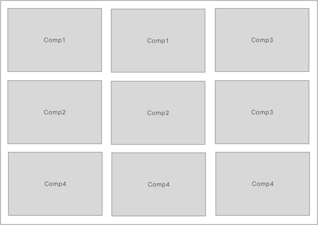
"layout": {
    "areas": [
        [
            "comp1",
            "comp1",
            "comp3"
        ],
        [
            "comp2",
            "comp2",
            "comp3"
        ],
        [
            "comp4",
            "comp4",
            "comp4"
        ]
    ],
    "size": {
        "cols": [1, 1, 1],
        "rows": [1, 1, 1]
    }
}
Equal Distribution of a 3x3 Layout

In the size section, numbers represent the fraction of space that a widget can occupy, relative to the other widgets. All three columns occupy equal 1 fraction of space. With 100% as available width, each widget occupies 33.33% of horizontal space.

With Equal Column Width

Another use case example, if you set as "cols": [1, 2, 2], it means that overall space is divided by 5 (1+2+2) and the first widget occupies 20% of horizontal space. The second and third widgets take 40% each. For more information, see Basic Concepts of Grid Layout.

After Changing the Column Width

page > ROOT

Nesting of layouts is called a sublayout. In case you have nested layouts in your layout configuration, you must have a single "ROOT" object as a parent for sublayouts. Otherwise, your layout configuration can be flat if no nesting is required.

This sublayout provides more control over the layout resize behavior. The page layout property must be of type Record<string, Layout>. The layout property allows you to arrange the widgets on a page.

{
    "id": "some-id",
    "widgets": {
        "c1": {
            "comp": "div",
            "textContent": "c1"
        },
        "c2": {
            "comp": "div",
            "textContent": "c2"
        },
        "c3": {
            "comp": "div",
            "textContent": "c3"
        },
        "c4": {
            "comp": "div",
            "textContent": "c4"
        },
        "c5": {
            "comp": "div",
            "textContent": "c5"
        }
    },
    "layout": {
        "ROOT": {
            "areas": [
                ["c1", "sub1"],
                ["c2", "sub2"],
            ],
            "size": {
                "cols": [1, 1],
                "rows": [1, 1]
            }
        },
        "sub1": {
            "areas": [
                ["c3", "c4"]
            ],
            "size": {
                "cols": [1, 1],
                "rows": [1]
            }
        },
        "sub2": {
            "areas": [
                ["c1"],
                ["c5"]
            ],
            "size": {
                "cols": [1],
                "rows": [1, 1]
            }
        }
    }
}

This setup creates a grid in the ROOT layout with two subgrids that you can resize independently.
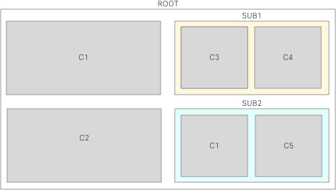
Sub-layout Appearance

Resizing a component affects the components within that sublayout.
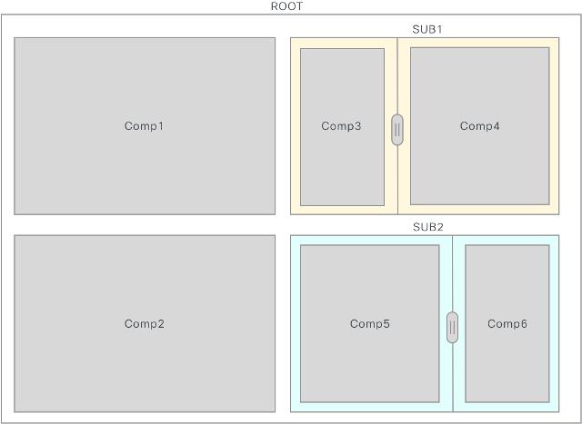
After Resizing both Sub-layouts
Note

Be aware of the following cases:

Infinite loop: If you include ROOT layout as a sublayout of ROOT, it causes a "call stack exceeded" error and runs into an infinite loop.
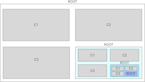
{
    "layout": {
        "ROOT": {
            "areas": [
                ["c1", "c2"],
                ["c3", "ROOT"],
            ],
            "size": {
                "cols": [1, 1],
                "rows": [1, 1]
            }
        }
    }
Sub-layout With Infinite Loop


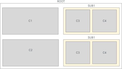
Same Sub-Layout (N) times: If you include the sublayout into your grid more than once with the same name, and if you resize one of them, all the sublayouts get resized automatically.

If this is not the desired behavior, rename each of the sublayouts with a unique name.
{
    "layout": {
        "ROOT": {
            "areas": [
                ["c1", "sub1"],
                ["c2", "sub1"],
            ],
            "size": {
                "cols": [1, 1],
                "rows": [1, 1]
            }
        },
        "sub1": {
            "areas": [
                ["c3", "c4"]
            ],
            "size": {
                "cols": [1, 1],
                "rows": [1]
            }
        }
    }
}
Sub-layout with N times


Attributes for Persistent Tabs

To set the tabs in the custom pages and custom widgets as persistent, enter the attributes for md-tabs in the custom layout.

Example: Set Tabs as Persistent

{
    "comp": "md-tabs",
    "attributes": {
        "persist-selection": true,
        "tabs-id": "unique-id for all the tabs together in the container"
    },
}

Property

Description

persist-selection

To set md-tabs to be persistent. The default value is true.

tabs-id

Unique identification for all the tabs together in the container.

When you set md-tabs to be persistent (persist-selection: true), Agent Desktop retains the tab selection even if an agent switches between pages or widgets in the Desktop.

Note
  • The persist-selection property is not applicable for the tabs in the Auxiliary Information pane and Agent Performance Statistics reports page, because the persistent tab behavior is already set in the Desktop.

  • The tab selection is reset to the default tab when you sign out of the Desktop, reload/refresh the browser, or clear the browser cache.