Desktop Layout Overview
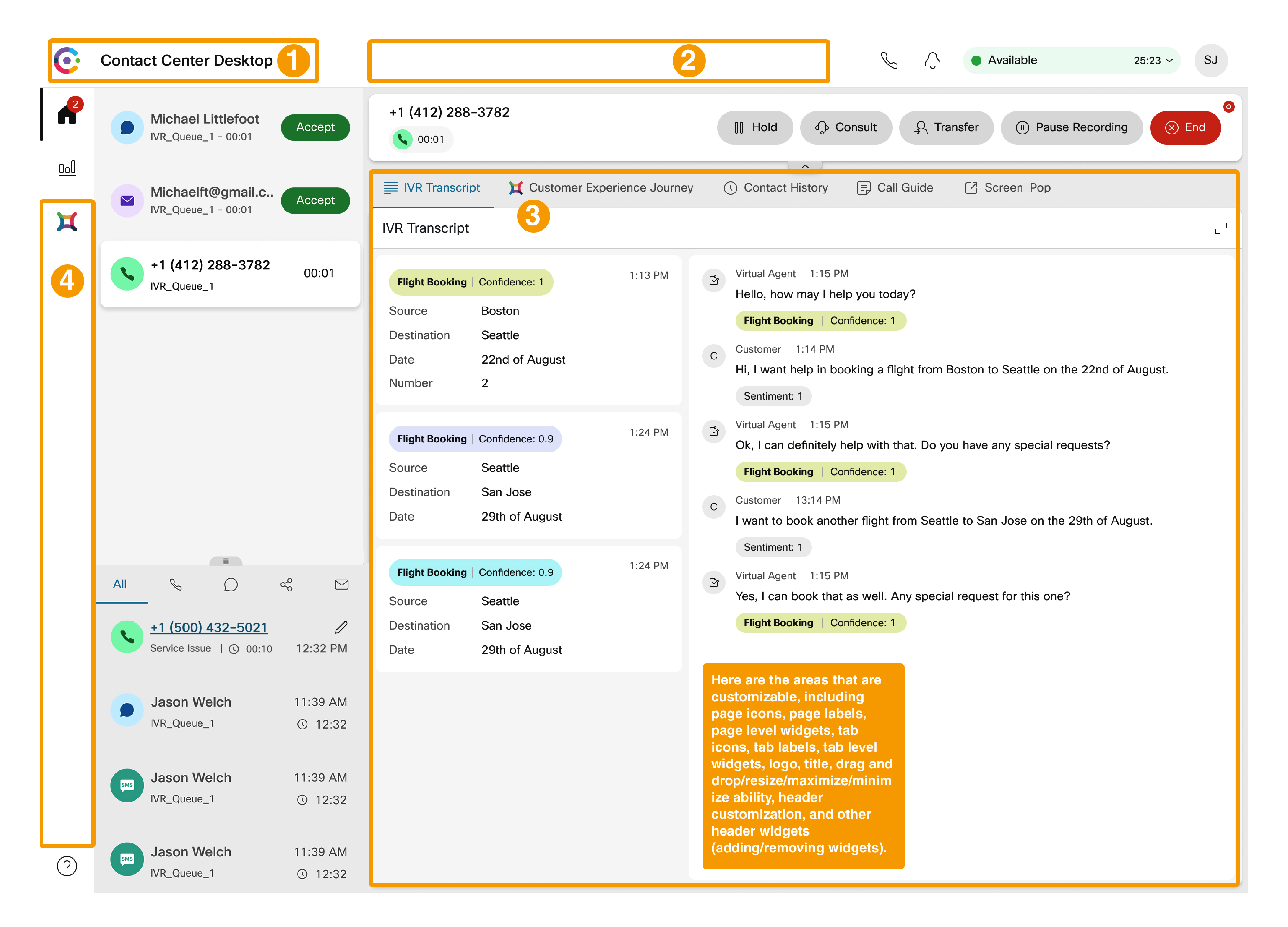
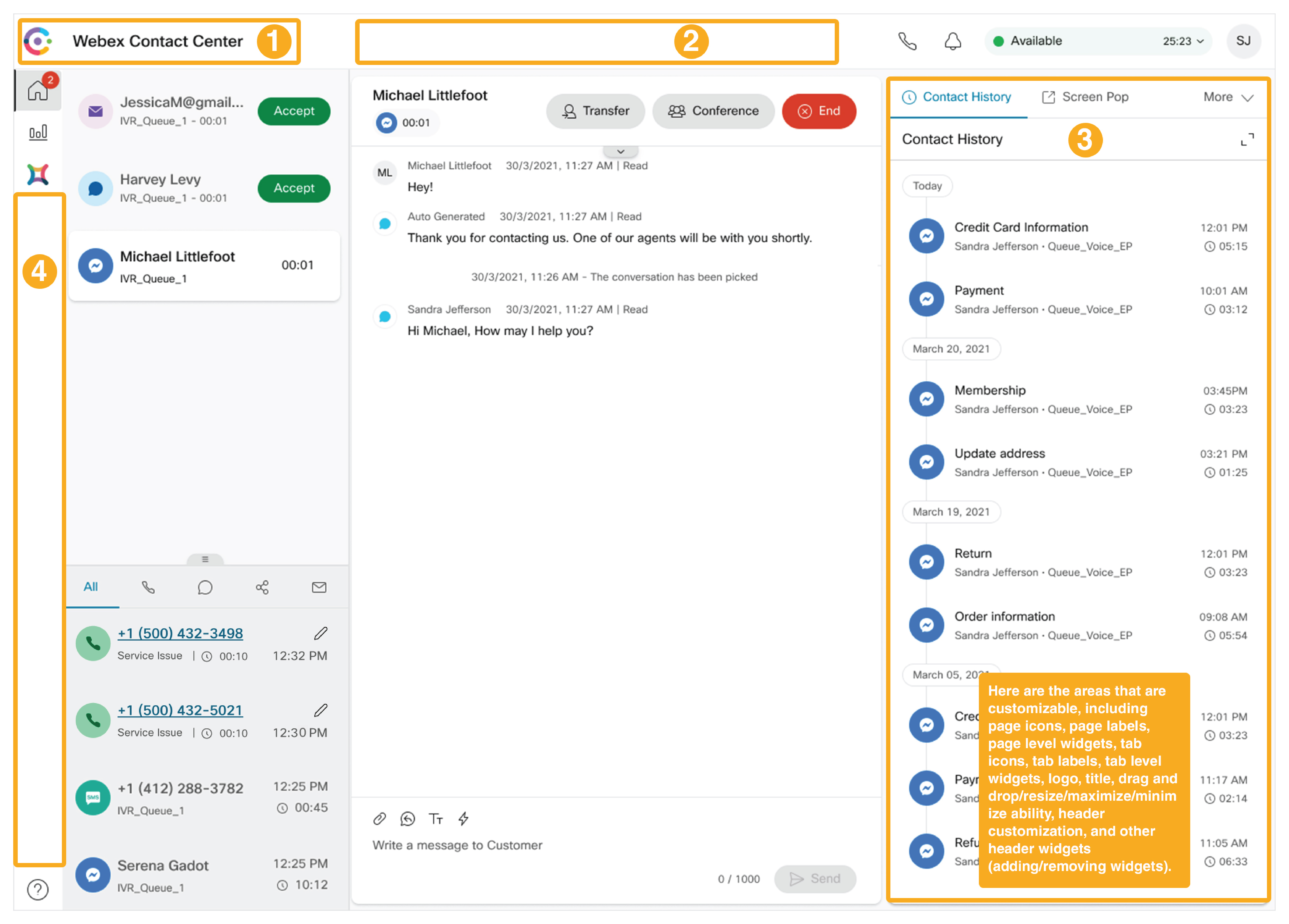
The following list details the spaces that you can configure. The images illustrates the layout of the Desktop:
-
Title and Logo area: This space displays the Webex Contact Center logo and name (default) at the top-left corner of your screen.
-
Horizontal Header area: This space has a configurable area that is populated with custom widgets. These widgets can display, for example, inline information and drop-down menus. As the height of this header is only 64 pixels, the widget height cannot cross the header height.
-
Workspace area: This space changes as per the selection on the navigation bar or when an agent is interacting with customers. When an agent is on a call, this area displays the interaction control and auxiliary information pane (that includes custom widgets and persistent widgets). When an agent is interacting on email, chat, or social channels, this area displays the workspace area and auxiliary information pane (that includes the persistent widget area).
Custom Page displays on the Desktop interface in the workspace pane. You can access the custom page through icons on the navigation bar. Each custom page can contain one or more custom widgets.
Custom Widget is a third-party application that is configured in the JSON layout. You can place the custom widget on the custom page, custom tab (Auxiliary Information pane), or on the horizontal header of the Desktop.
-
Navigation Bar area: Use this space to add navigation items to access custom pages.

