JSON Layout Top-Level Properties
The following are the top-level properties for JSON layout:
"version": "0.0.5",
"appTitle": "Webex Contact Center",
"logo": "https://my-cdn.com/logo.png",
"taskPageIllustration": "https://www.abc.com/image/logo.jpg",
"stopNavigateOnAcceptTask": false,
"dragDropEnabled": false,
"notificationTimer": 8,
"maximumNotificationCount": 3,
"browserNotificationTimer": 8,
"wxmConfigured": false,
"desktopChatApp": {
    "webexConfigured": false
},
"headerActions": ["outdial", "notification"],
"area": {
    "header": {
        ...
    },
    "panel": {
        ...
    },
    "navigation": {
        ...
    },
    "persistent": {
        ...
    },
    "headless": {
        ...
    }
},Note |
|
appTitle
To specify a title on the horizontal header of the Desktop. The default title is Webex Contact Center.
Example:
"appTitle": "Webex Contact Center"Note | The default appTitle is changed from |
The title can either be text, an image, or an empty string. The title text appears in two rows. If the text extends beyond the second row, an ellipsis icon is displayed, and the tooltip displays the complete title. Styles cannot be applied to the title.
You can either use data URIs (Uniform Resource Identifier) or host a custom title image on a content delivery network (CDN), Amazon Web Services (AWS) Simple Storage Service (S3) bucket, or a similar hosting service, and then specify the URL to the hosted image. The supported title image formats are PNG, JPG, JPEG, GIF, SVG, and WebP. The supported title image size is 184 x 32 pixels (width x height).
logo
To specify a URL for the company logo. If you do not provide a URL, then the Webex Contact Center logo appears by default.
Example:
"logo": "https://my-cdn.com/logo.png"You can host a custom logo image on a CDN, Amazon Web Services (AWS) Simple Storage Service (S3) bucket, or a similar hosting service, and then specify the URL to the hosted image. The supported logo image formats are PNG, JPG, JPEG, GIF, SVG, and WebP. The supported logo image size is 96 x 32 pixels (width x height).
| Condition | Example | appTitle | logo |
|---|---|---|---|
| If appTitle and logo are not configured |
|
No title | Default logo |
| If appTitle and logo are configured |
|
Configured text | Configured logo |
| If appTitle is configured and logo is not configured |
|
Configured text | Default logo |
|
If appTitle is not configured and logo is configured |
|
No title | Configured logo |
| If appTitle is configured and logo is not preferred |
|
Configured text | No logo |
|
If appTitle is not configured and logo is not preferred |
|
No title | No logo |
| If appTitle is added as an image and logo is configured |
|
Configured image | Configured logo |
|
If appTitle is added as an image and logo is not configured |
|
Configured image | Default logo |
|
If appTitle is added as an image and logo is not preferred |
|
Configured image | No logo |
Note |
|
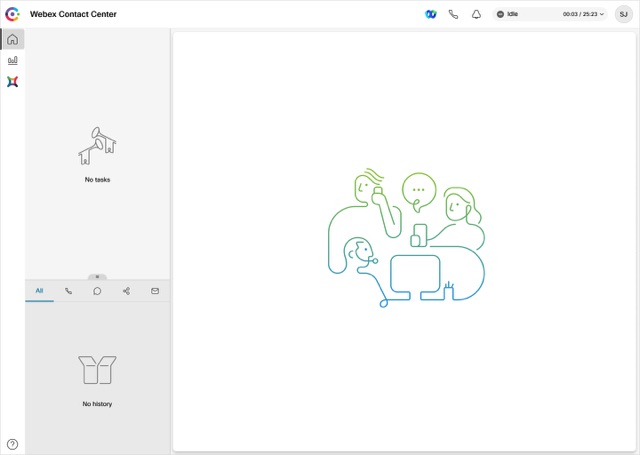
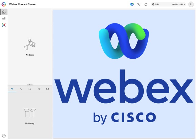
taskPageIllustration
To specify a custom illustration for the task page based on organization preferences and brand alignment. When an agent signs in, the task page displays the configured illustration as a background. By default, the task page appears without illustration.
Example:
"taskPageIllustration": "https://www.abc.com/image/logo.jpg",You can either use data URIs or host a custom illustration on a content delivery network (CDN), Amazon Web Services (AWS) Simple Storage Service (S3) bucket, or a similar hosting service, and then specify the URL to the hosted illustration. The illustration can be configured at the global or team level based on the layout definition. Ensure to configure the correct URL to prevent the broken image from being displayed on the Desktop.
The supported task page illustration formats are PNG, JPG, JPEG, GIF, SVG, and WebP. The recommended illustration size is 400 x 400 pixels (width x height). If the custom illustration size is larger than the recommended size, the illustration size is adjusted based on the aspect ratio in the task page. If the custom illustration size is smaller than the recommended size, the actual illustration size is retained in the task page.


stopNavigateOnAcceptTask
To determine whether to shift the focus to a newly accepted task, when the agent accepts the new task while working on a previous task. The default value is false.
Example:
"stopNavigateOnAcceptTask": falseIf the value is set as true, when the user accepts a new task on the Desktop, the focus is retained on the previous task and does not shift to the newly accepted task. This setting prevents the user from losing any data when accepting a new request.
For example, consider that Agent 1 is on chat with Customer 1 and simultaneously on a voice call with Customer 2. During the voice call, Agent 1 is updating the details of Customer 2 in the Interaction Control pane. Currently, Agent 1 has two active tasks in the Task List pane, and the focus is on the Interaction Control pane. When Agent 1 accepts a new chat request from Customer 3, the focus remains on the Interaction Control pane with Customer 2 and does not shift to the newly accepted chat request.
To retain the focus on the previous task and not to shift to the newly accepted task, select the custom layout with the stopNavigateOnAcceptTask property value set to true.
If the stopNavigateOnAcceptTask property value is not entered in the JSON layout, the Desktop shifts the focus to the newly accepted task. The behavior is similar to when the stopNavigateOnAcceptTask property value is set to false.
Note |
|
dragDropEnabled
To enable the drag-and-drop and resizing of the widgets on the custom pages, set the value to true. The default value is false.
Example:
"dragDropEnabled": falseFor more information about enabling the drag-and-drop feature for the tabs in the Auxiliary Information pane, see Auxiliary Information Pane.
notificationTimer
To set the duration (in seconds) after which the desktop notifications on the Desktop are automatically dismissed. The notification appears at the top-right corner of the Desktop. The default timeout value is 8 seconds. The valid range for timeout values is 1-10 seconds. For the timeout changes to take effect, the browser must be refreshed after the changes are made.
Example:
"notificationTimer": 8maximumNotificationCount
To set the number of desktop notifications to be displayed at a time on the Desktop. The default value is 3. The range for desktop notifications is 1-10. The desktop notifications are stacked. If there are many notifications, they appear with a slight delay depending on the notificationTimer settings.
Example:
"maximumNotificationCount": 3browserNotificationTimer
To set the duration (in seconds) after which the browser toaster notifications on the Desktop are automatically dismissed. Toaster is a native browser notification that appears only if the Desktop is not the active browser window or tab. The Desktop browser window or tab is inactive when
-
You are working on other browser windows or tabs.
-
You are working on other applications.
-
You have minimized the Desktop browser window.
The notification appears at the top-right corner of the Desktop. The default timeout value is 8 seconds. The recommended range for timeout values is 5-15 seconds. For the timeout changes to take effect, the browser must be refreshed after the changes are made.
Example:
"browserNotificationTimer": 8Note | The configured timeout for browser notifications depends on the operating system and browser settings. The timeout value is honored in the Chrome browser across Windows OS, Chrome OS, and macOS. However, the other supported browsers do not honor the configured notification timeout value consistently. |
wxmConfigured
(Optional) To configure Webex Experience Management, set the value to true. The default value is false. For more information, see Add Widgets to Webex Contact Center.
Example:
"wxmConfigured": truedesktopChatApp
To configure multiple Cisco-offered chat applications such as Webex App.
webexConfigured
Webex App along with its messaging, calling, and meeting functionalities, can be configured within the Desktop. This configuration allows agents to collaborate with other agents, supervisors, and subject matter experts (SMEs) in their organization without navigating away from the Desktop.
Note |
|
To configure Webex App within the Desktop:
-
In Cisco Webex Control Hub, when adding services for a user, select the Advanced Messaging check box (). For more information, see Manage User Accounts in Cisco Webex Site Administration.
-
In the custom Desktop Layout, set the
webexConfiguredproperty value totrue.Example:
"desktopChatApp": {
    "webexConfigured": true
},
The default value of the
webexConfiguredproperty isfalse.NoteIf you set the
webexConfiguredproperty value totrue, Webex App is available for the agent by default. The agent cannot sign out of Webex App.To display the
 (Webex) icon on the horizontal header of the Desktop, enter the value
 webexin theheaderActionsproperty. For more information, see headerActions.To enable Webex App for a specific team, select the custom layout with the
webexConfiguredproperty value set totrue. For more information, see Create a team.
You can configure Webex App in the Auxiliary Information pane, custom page, and custom widget also. For more information, see Auxiliary Information Pane.
Webex App Notification
The values that are specified using the notificationTimer and browserNotificationTimer properties for the notification timer are applicable for Webex App. The default timeout value is 8 seconds for these properties. For more information, see notificationTimer and browserNotificationTimer.
headerActions
To change the order of the icons on the horizontal header of the Desktop. The default order is as follows:
-
 (Webex)
 -
 (Outdial Call)
 -
 (Notification Center)
Set the value of the headerActions property as follows:
|
Icon Name |
headerActions Property Value |
|---|---|
|
Webex App |
webex |
|
Outdial Call |
outdial |
|
Notification Center |
notification |
Example:
"headerActions": ["webex", "outdial", "notification"],Note | The |
To change the default order of the icons, enter the headerActions property and the values in the custom layout accordingly.
Example:
"headerActions": ["notification", "outdial", "webex"],Note |
|
area
The area property is the core section of the Desktop Layout. You can define the layout as per the area.
"area": {
    "header": {
        ...
    },
    "panel": {
        ...
    },
    "navigation": {
        ...
    },
    "persistent": {
        ...
    },
    "headless": {
        ...
    }
},
You can configure the following area objects:
-
Panel: Represents the second panel or the right-most panel in the Auxiliary Information pane.
-
Navigation: Represents custom pages and their navigation elements that are related to the pages.
-
Persistent: Represents the page-level widgets that are persistent and display on all pages of the Desktop.
-
Headless: Represents the widgets that do not have a visual interface, but execute logic in the background.
Note | If advancedHeader property is configured, the header and headerActions properties must be removed. |